
What if you lost one lead this year because your website wasn’t optimized for conversion?
No biggie, right?
Well, no biggie so long as that lead wasn’t going to turn into a deal… if it was, then that’s $10,000, $20,000, or even $30,000 straight down the drain.
And, as my real estate agent says, “It only takes one – the right one.”
Sadly, for most unoptimized websites, the truth is much more depressing than a single lost lead per year. A website that loses one lead from your target market, after all, is going to lose all similar leads.
This is why preparing your real estate website to convert its visitors is absolutely vital… before you drive traffic to it (paid and organic). How, though, do you know if your website is or isn’t optimized for conversion?
Well, at Carrot, we’ve generated millions of real estate leads for our thousands of members, and these are four tell-tale signs that your website is losing you money.
4 Signs that your website isn’t generating the online real estate leads as it should
1. Your Website Isn’t Mobile-friendly
For our thousands of Carrot members, 64% of all leads come through a mobile device. Not through a desktop or laptop, but through a thumb-clicking phone.
And that’s happening all over the online world, not just at Carrot. 52% of all global online traffic is generated from smartphones, according to Shane Barker.
This means, if you’re going to convert over half of your website visitors, you can’t create a bad mobile experience. Google is taking this so seriously that they recently rolled out mobile-first indexing – which basically means that they prioritize the performance of the mobile version of your website over the desktop version. And they’re not the only ones who take mobile website performance seriously…
So do your website visitors.
In fact, 61% of buyers form more positive opinions about brands that offer a remarkable mobile experience, according to Crazyegg.
That’s why, at Carrot, every single one of our website designs is crafted to convert visitors regardless of the device they’re using to browse.

Here are some signs that your website isn’t mobile friendly…
- You can scroll side-to-side and the screen doesn’t adjust to the size of the device.
- The words become so small they’re unreadable on a mobile device.
- The buttons are difficult to click with a normal-sized thumb on mobile.
If any of those are true of your website, then you’re definitely losing mobile phone leads – and switching to a mobile-friendly real estate website design like Carrot could outright double your lead generation.
2. You’re Not Making It Easy For Visitors To Give You Their Information
Still today, most homepages look like this…
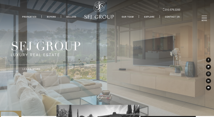
At the top, there’s a title, then there’s a menu and heading. And there’s maybe some sort of vague CTA – in this case, the “Learn More” button.
As you scroll down, you’ll see pictures of the real estate agent (or investor), maybe some testimonials, some notes about their services, and then finally a decent CTA.
Now, that probably doesn’t seem like a big deal…
Do people really care all that much if they have to scroll to find your CTA?
To answer that question, let’s look at a quick study done by Bryan Harris – an email list building guru. He took his “right-side up” homepage and flipped it so that the CTA was front-and-center when someone arrived on his website.
Immediately, he saw a 35% increase in his number of subscribers.

Remember, people who’re looking to buy or sell their home are looking for a solution to their problem. The faster you solve that with a relevant CTA, the more likely they are to opt-in.
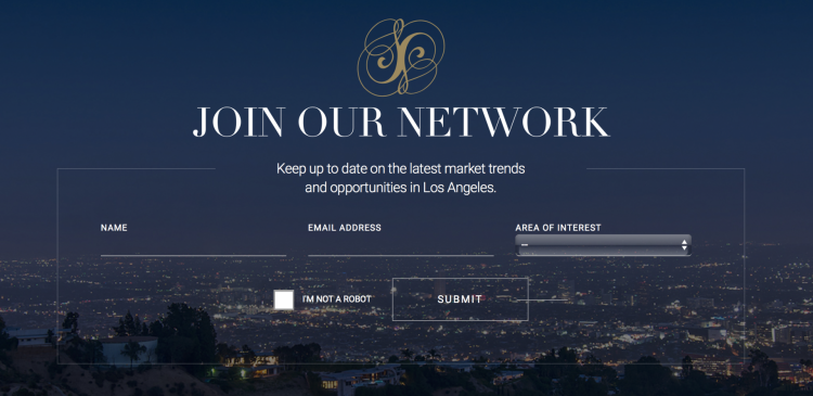
But you might be wondering what an upside-down homepage actually looks like.
At Carrot, we exclusively use the high-converting upside-down homepage model – putting the contact form and phone number right at the top of your website (on mobile and desktop) to guarantee that visitors to your website aren’t lost because they have to scroll more than they’d like.

Here’s a quick testimonial from a Carrot member, Adam Mitchell, who spent $1000s on the wrong marketing and an under-performing website. He now does multiple deals per month in a competitive market.

3. The Sales Copy Isn’t Scientific
What do I mean when I say that your homepage copy should be scientific?
I mean that there should be a clear and obvious reason that each phrase and word is in its place. And if you’re wondering whether you wrote your homepage scientifically or not – with the psychology of your visitor’s in mind – then you definitely didn’t.
Because scientific sales copy has to be intentional from the very beginning.
Here’s a typical example of sales copy that misses the scientific mark.

A lot of people try to make their sales copy creative and cute…
But that isn’t what you need. What you need is sales copy that appeals to people’s problems and then promises a remarkable solution.
And the headline is the most important element, with 80% of people only reading the headline and 20% reading the rest. In other words, you need to strike the right chords in the right order, quickly.
You need to be scientific.
Here are a few examples of psychological rules in sales copy.
The word “because” with a reason after increases conversion by 60% to 94% – it doesn’t even matter what the reason is, it just matters that you have a reason for what you’re selling, how much it costs, and why you’re the one selling it.
Similarly, social proof – such as testimonials and credibility bars – can significantly increase the conversion rate of your website. For one website, social proof increased the conversion rate by 20%.
But, those are just a few examples.
For your formulaic sales copy pattern, follow these three steps, in this order:
- Empathetic description of pain – First and foremost, your prospect needs to know that you know exactly what they’re going through. After all, how could you possibly help them if you don’t understand their current position?
- Agitate that pain – Then, the prospects needs to be reminded of how terrible of a situation they are really in. Your goal is to empathetically remind them of how difficult their predicament is so that they’re ready to get out of it.
- Promise a solution that’ll take that pain away – Finally, in swoops Super Man. Your solution. Guarantee them with all the tools you have in your arsenal that your service (whether agent or investor) is going to remove their pain, then tell them how it’s going to do that.
Consider our very own sales copy as an example of this. It’s only a few sentences, but it hits every note.

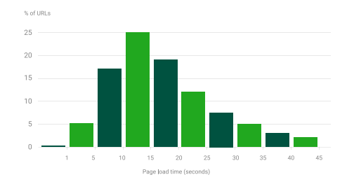
4. Your Website Has Slow Load Times
The slower your website loads, the more people who won’t stick around to see what you have to offer.
Higher bounce rate. Fewer conversions.
Period.
As Neil Patel explains on his blog, for instance, 53% of people will leave a mobile site if it takes more than three seconds to load. And 47% of online users expect a website to load in just two seconds or less.
As the nail strikes the coffin, a one-second delay in page response time often results in a 7% reduction in conversions.
And most websites aren’t keeping up.
If you have a slow website, how many thousands of dollars might you be losing for each second? Here’s some quick math.
Imagine that you get 2,000 visits to your website every month at a 10% conversion rate. That’s 200 conversions. Then imagine that you close 1 in 20 of those. That’s 10 deals per month.
Now let’s assume that you make $10,000 per deal.
At a 7% reduction in conversion rate for every one-second loss of load speed, just a two-second delay would lose you upwards of $10,000 or more every single month.
This is why, at Carrot, we don’t mess around with slow load speeds. In this tech-stack study of 150,000 websites, Carrot outperformed Wix, Squarespace, and WordPress. In fact, Carrot was second to Google’s own website.

Conclusion
Maybe in the 90’s, just having a website was enough. Just having a place where people could go online and learn about your business would do the lead-generation trick. But now we’re down the road…
And we know what converts visitors… and what doesn’t.
Still, many websites haven’t caught up with the times and optimized their websites for conversion. This is unfortunate, considering the significant impact that conversion optimization can have on business success.
So, a quick recap.
Avoid these four real estate website pitfalls that can kill your lead generation…
- It’s not mobile-friendly.
- The homepage isn’t easy asking for their information.
- The sales copy isn’t scientific.
- It has slow load times.