Designing a high converting homepage is a challenge. We’re going to dive in and show you what it takes to create a great real estate investing or agent homepage. Writing strong content is only part of it. There are many elements that work as a team to steer your visitors to fill out your form or give you a call… we call it the Carrot Conversion Methodology.
In this Carrot Strategy Sketch, Trevor explains what the basic format of a website that would perform well should look like.

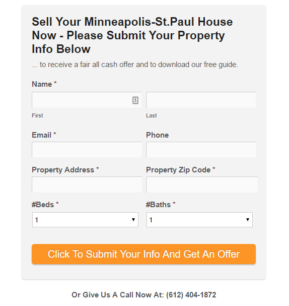
Designing A High Converting Real Estate Investing Home Page
Hey, this is Trevor with InvestorCarrot coming at you with another Strategy Sketch whiteboard video.
A lot of people ask, “Why do the Carrot websites perform so well?” Now, we do lots of testing, that’s number one. We have a full team that does conversion testing, and we spin up new designs and new sites, and all kinds of stuff.
So, we have the resources and ability that most investors don’t have.
One really cool thing that we have and are really fortunate to be able to leverage as an asset is you guys. Our customers generate hundreds of thousands of leads per year, and we have all that data that we can leverage and test on to see what works great.
This video is about what the basic format of a website that would perform well, is. It could be your motivated seller website, cash buyer, rent to own tenant, land seller, or whatever the heck it is. We follow the same format with all different types of leads. Not even just in real estate, but in other businesses that I run, we follow a very similar format, as well. It’s just something that really works.
We’re going to dive in and by the end, I don’t want you to take this template and run with it. I want you to go, “Why do certain things work and what on my website do I need to adjust?” That’s what we are looking at here. Look at the big chunks of things. I’ve numbered some of the things out here.
Lead Generating Homepage

You’ll notice on our InvestorCarrot website we have a lot more elements than just these six or so. I’m picking the six big chunks you can focus on in your website to make it perform better. We’re talking about a homepage.
One of the big things is your homepage should be a lead generating page. A lot of people make their homepage so when someone lands on it, it’s “welcome to X site.” People don’t want to be welcomed to your site. They have a problem or an opportunity in their mind that they need to solve. You need to directly and immediately address that problem with how you can benefit them and solve it.
That’s one of the first things that they need to see.
The Hero Section
Start off with the benefit. That’s what’s going to draw people in first. They are going to go, “This speaks to me. They can solve my problem.” From there, the visitor is going to be looking around at the other things.
The first thing they usually look at is up here in the upper left, your branding, your benefit statement. The benefit statement is going to interest them to look at the rest. From here you want to go, “here is the benefit statement, but let’s draw you toward exactly how you can engage us and work with us.”
We have what we call an eye director.
Often times we’ll use an arrow. It doesn’t have to red. It doesn’t even have to be an arrow, but something that gets someone to have a cue that they need to look in this direction. We have an eye director that directs your eye towards the call to action area.

Most real estate investors do not have what we call the hero section. The hero section really is the hero of the page. It’s the thing that really reels website visitors in, engages them, and gets them to convert as a lead. Your hero section should have your benefit and eye director that focuses on the call to action.
At the top of your opt-in form, make sure it’s a benefit. What is it that they are going to get and what do they have to do to get that? If we are going to be focusing on, let’s say, rent to own tenants, we can say access our free rent to own tenant list. Just fill out the information below and you’ll see the properties on the other page. Be very clear what they get and very clear how they do it.
You want your call to action box to be big. That’s one of the biggest mistakes a lot of people make is that they have this little tiny call to action box and a tiny, tiny button. We want to make sure that the button is so big that you can’t ignore it. Like you almost accidentally click it. We want to make the button so big and so obvious.
You can see in this markup that we have the button a completely different color. Roll back to the start of this video and see what you were looking at. What was the first thing that your eye was drawn to on this whiteboard when you turned the video on? My guess is that it was these big orange hunks.
That’s very intentional. You want your website to do the same thing. You want your website to pass the grunt test. Like a caveman. If someone can, within five seconds of landing on your website, give it the grunt, then you know you are doing it right. If you don’t pass the grunt test, you need to get to work and make sure you have your benefit and clearly outline the spot that they know what they need to do next.
Make your button as wide as the form fields and a different color than the rest of the website so it contrasts. It doesn’t matter what color your button is just as long as it can contrast from the rest of the website so your eye is drawn there.
Next, what we are going to do is your branding. Having your phone number at the top is very, very important as well. You want to make sure there isn’t something that looks bad or ugly at the top of the site. With InvestorCarrot, we have a very simple logo builder inside the system if you don’t have a logo yourself to make it look good. Get something up there that looks good.
Always have your phone number at the top and bottom of the website and in your content. I’m going to tell you why it’s really important that the phone number is at the top of your site here in a second.
Below The Hero Section
After the hero section, if someone isn’t ready to become a lead and engage with you then they start to dive in and do more research.
That’s where the rest of your homepage and the rest of your web site come in handy.
Your hero section should really drag them further into the rest of your content. Have another headline here that gives a benefit. Sell your house fast in seven days, close on the date of your choice, or whatever it is that is your main benefit. If they go, “Yeah, that’s what I want.” They are going to keep on reading down.
I always like to engage people with pictures on the website. If you have some pictures that you can put up there of properties you have or deals or whatever it is that really adds realism to it. Make sure the pictures are local to your area.
Drag them down with benefit oriented text.
- How can we help you?
- What are your problems?
- Here are the problems that we can help you with.
- Here’s who we are and why we are qualified to do so.
At the bottom of the page, no matter how long or short your page is, make sure you always have a very similar call to action at the bottom. As you can see, a huge button, maybe even the same form that is up top. When someone scrolls down, we don’t want them to have to scroll back up to be able to engage with you.
You always want to have a call to action right where they are. If they have to make a decision on what they need to do next, you’re probably going to lose them. Their decision is probably going to be to hit the back button. We don’t want to help them hit the back button. We want them to do what we want them to do at the time that we want them to do it.
Here’s an example of call to action below the hero section
Social Proof
The next thing is over on the sidebar. Social proof. Social proof is basically testimonials, credibility. It’s comforting your prospects and customers that other people have gone before them and you have solved their problems in a really, really great way. Find some social proof, some testimonials from your customers, from partners you have worked with. Get them on your website even if you only have one or two to start. Get them on there.
Notice how they give the specific result and situation how this investor helped them? Perfect!

Your Most Important Pages
According to lots of tests that we have done, we actually wrote a blog post on this, always in the top three most visited web pages on every website is the about page, no matter what type of investor or different websites in different industries. Our data always has the about page, our company, or whatever you call it, in the top three. That’s because people are always trying to prove or disprove their thoughts about you, about whether you are a company they want to work with. They want to work with people. They want to make sure they can connect with you.
Make sure you’ve got your “about” information basics and that it links back to your full about page.
You also want to make sure you have your navigator bar. Mainly it’s the FAQ, the about, how you can help me, things like that.
Mobile-Optimized

All this stuff is really important, but none of it is going to work very well if it’s not mobile optimized. Not just mobile responsive, we’re talking does it perform well to get someone to actually engage on the website and convert as a lead on a cell phone. There are a couple of elements you really want to take note of on a cell phone. If you are not a web developer, pass this along to your web guy or all of this is already on the InvestorCarrot. So, if you find that InvestorCarrot is a better solution for you, we’d love to have you.
On the mobile side of things, make sure…number one, it is responsive, so it shrinks down to the size of your screen so it looks good. Number two, make sure your branding shrinks down as well but is at the top of the website. Make sure you’ve got your phone number at the top of the website and not wrapped in an image.
Someone can’t tap on that image and have your cell phone pop up and say, “Do you want to call them?” Anytime you put a phone number on a website, on an iPhone, or on most Androids, you can tap the phone number and that pops up a box that says, “Do you want to call this number?” It makes it really easy for someone to call so they don’t have to try to remember what the number is, bounce back to their phone call feature, and forget what the number is. When they bounce back over there, they’re like, “I’ll call them tomorrow.” They end up not calling. Get the phone number up top.
Just like on a computer, have a very clear benefit-oriented headline, the same text, and a huge opt-in button that spans the entire width of your screen. One reason for this is when someone is holding their cell phone, and I have seen some real estate investor websites that have their call to action button way up in the upper left and it makes it a lot harder for someone to get up there to take that action. We want to make it very, very low resistance for someone to work with us. Right there where I’m holding it, tap it, tap it, they’re good to go.
Six-Step Format
This is a simple, six-step format for making your homepage and real estate investor website a lot more effective. Dive into our blog and into our other videos for more details and more specifics on how exactly to write your copy, exactly what other elements go into your website and make them a lot more effective.
Thank you guys for watching this week’s whiteboard video. Keep hitting us with questions and we’ll keep coming at you with great content.
Are you investing in multiple markets? Then be sure to check out this Carrot Strategy Sketch: Wholesaling in Multiple Markets? Here’s What Your Website Strategy Should Be
Great video Trevor, in this post card/yellow letter saturate REI world a good converting website is a MUST! keep up the excellent work buddy!
Thanks man!
Yessir, gotta have a stellar website to help amplify the ROI of your offline marketing. Keep crushing it out there too man! We appreciate ya!
Love that carrot is mobile friendly. I’m continually surprised with how many mobile visitors I get with a brand new webpage.
Hey Trevor, this may not be the right venue to ask this but I want to create a video to promote my service to real estate investors using whiteboard animation. I went to Fiverr but didn’t get any useable info. Who would you recommend to create the video for me?
Thx,
Hey Herb! Huge apologies on not seeing this one earlier.
I’d honestly prefer people use videos that help them build credibility and connection w/ themselves (so you or someone on your team being on camera) but there definitely is a spot for having an animation video to explain things. I know many of our clients have had success with upwork.com finding outsourced talent to do things like that.
Go get ’em!
Any tips on how i can improve my homepage? Thanks http://www.nostresscashoffer.com/