So, you already know your website needs to be “mobile optimized”… right? In fact, 64% of our motivated house sellers, cash buyers, and rent to own tenant leads were from mobile devices last month. But what the heck does that mean and why is your “mobile optimized” website likely losing you tens of thousands of dollars per year in lost leads and lost deals without you even knowing it?
If you have the choice of a higher-performing website vs. one that loses leads… which would you choose?
You may be asking the question…
Does A Higher Conversion Rate On Your Cell Phone Visitors Really Matter?
Even if your mobile website for real estate investors is not responsive, it may still not be geared to convert visitors into qualified leads at a high rate. That’s a whole different ballgame.
You’re investing a lot of time, energy and money with PPC, Facebook, and SEO. You want to get qualified leads to your websites without any technical deficiencies. No mobile deficiencies.
Your Website On Mobile Is Perhaps More Important Than Your Desktop. Here’s Why…
Through Quarter 1 and Quarter 2, 2020, our Carrot members pulled in over 142,136 buyers, sellers, and tenant leads all through mobile devices (cell phones and tablets).
That number doesn’t include any leads that came through on desktop computers or any phone call leads (which according to our surveys is as much as 2x more than the online opt-in leads).
A full 64% of our member’s leads came from mobile devices last month. That’s a lot.
This is why internally we started making it a point to make it an everyday practice to spend as much time using our cell phones on our customer’s sites so we can continually improve the mobile experience and conversion rate.
Here’s an interesting stat for you…
The visitor to lead conversion rate on our Carrot websites is a full 3 percentage points higher on mobile devices than on desktop computers.
Why?
Because most real estate investor websites look really bad on mobile and aren’t set up to perform well on mobile… so a web searcher bounced off of those sites… back to Google… finds a Carrot site (which is streamlined to generate leads on mobile devices) and engages in the Carrot site… becoming a lead.
We feel right now anyone with a really well-optimized mobile responsive website design has a big edge on those who don’t.
As we’ve really shifted a lot of our focus over to mobile (we believe in getting ahead of the curve vs. following it) we’ve seen some really interesting patterns in the way people use their different devices to find information online.
Here’s a graph below that shows when people are using different devices during the day.
Basically, people are using mobile devices the vast majority of the time in non-work hours. And these tend to be the times that more leads come in on mobile devices by far.
In fact, digging into our own data… we found the same exact trend in fact.
Percent Of Leads By Time Of The Day From Mobile And Tablet
Notice how the mobile leads on our system correlates in a big way with the mobile usage patterns… but also see the importance that mobile plays when people are at home.
It’s a big deal.
So We Know That Mobile ISN’T The Future, It’s The Dominant Force Already…
Below we’ll dive into how your real estate investing website or agent website should be designed to maximize your chance at converting your visitors into qualified leads.
In fact, I’m going to go out on a limb here and say… if you don’t nail the mobile experience and focus a lot of energy into it… in 12-24 months your website will be left in the dust (it’s already happening).
Will you catch up or be left behind?
If you lose just 1 deal a year because of lost leads from a suboptimal mobile experience and you average 10k in profits, is that money you’d rather figure out how to keep?
If you’re driving traffic to your website right now, and not implementing proper mobile techniques, then you most likely have a leaky bucket. Phantom expenses stacking up and taking money out of your bank account.
If you don’t stay ahead of the curve searching in mobile, you’ll end up getting trampled by your competitors. Attract mobile customers and turn them to lead. Save yourself at least one deal a year. That’s way worth it for the time it takes to get mobile optimized.
Here are some tips to help you better optimize your website for those mobile visitors.
1. Get Your Real Estate Investor Website Google “Mobile Friendly” + Responsive
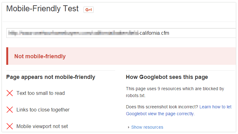
Google’s stance on mobile is to create a responsive website. It’s likely that responsive sites get an edge in searches from a mobile device. Google also started penalizing sites in mobile search that aren’t mobile-friendly.
What do you need to do to make sure your website mobile friendly?
Basically Google is looking for things that make it easy for your web visitor to read and engage with your website. Things like…
Font sizes big enough to see on a mobile device
Tap targets that are big enough for your fingers to use
Making the website just the width of the mobile screen so you don’t have to pinch pan and zoom (responsive)
… and more
Here is what Google recommends your font sizes to be for your mobile responsive version of your website.
You’ll See Something Like This If You Pass The Test!
What You See If Your Website Doesn’t Pass The Mobile Friendly Test
Once you get your site “Google mobile friendly”… don’t stop there like most of your competitors are.
Now we need to make sure your website is also set up to convert mobile visitors into leads at a high rate as well (which 9 out of 10 investors aren’t doing).
Next, Consider Moving To A Mobile Website For Real Estate Investors vs. A “Mobile” Website
If you have “mobile” website (usually indicated by your URL being “m.[yoururlhere].com”… consider switching over to a mobile responsive design instead (which Google prefers).
A responsive website is basically where you don’t take people to a separate URL if they visit with a cell phone (like mentioned above) but your website adjusts to look great on any screen size or device. Like this.
Here’s a real-world comparison of a website that isn’t mobile responsive and one that is.
See How This Carrot Site Reshapes Based On The Device It’s Being Viewed On
You can test your own web page for responsiveness. Just grab the side of your browser and move it to the side. A responsive page will adjust and shrink down. If the page is not mobile responsive, the shrink will hide parts of the page and force the visitor to pinch, pan, and zoom around. Which will most likely cause them to exit the page.
Want to see what your site looks like on mobile? GO TO the InvestorCarrot built mobile tester. Just type in your URL and press enter. It’s that simple!
If your website is not responsive, you’re probably a year and a half behind the curve.
Here’s A Short Video Showing The Difference Between a Mobile Responsive Investor Site And One That’s Not
2. Design For The Touch, Not The Click
Most web guys, do it yourselfers, and low-end website builders design their websites for the click on desktop computers.
But we have to remember that we usually use our THUMBS on our cell phones to “tap” parts of the screen rather than clicking.
It’s really easy to tap the wrong thing with your thumb on a cell phone screen… so we need to really design our pages with that in mind.
How do we design for the “touch”?
Look Where It’s Easy And Hard To Engage With… And Design Accordingly
The higher up the screen the harder it is to tap with our thumbs.
Not saying people won’t do it… I know I do… but whenever we can put the parts on our website we want people to engage in right below where their thumb already is… we make it easier for them and performance goes up.
We took that concept and overlayed a “tap map” over the top of some websites.
Check them out.
Notice The Important “tap” Elements On This Carrot Site In The Green Zone
That site above makes it really easy for the person to tap the form fields (they’re HUGE) and the orange opt-in button (it’s the full width of the screen and large).
On the flipside…
Notice The Very Small Form And It’s Trapped In The Red “tap” Zone
Also… it’s not just your calls to action and forms that you need to design for the “tap” to make it easier for people to engage with using their thumbs.
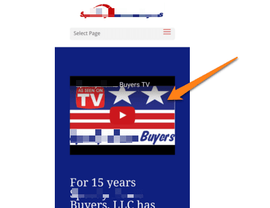
Look at this website below at how small the text is (not Google mobile friendly per tip #1 above) just to navigate the website. Tons of small links all crammed next to each other are a sure bet to sending your mobile visitors on a wild goose chase.
So what do you want to make sure you’re doing on your website for your mobile visitors?
Make your form fields large and the width of the screen
Make your opt-in buttons large, clear to read, and the width of the screen
Add space between your form fields so people don’t accidentally tap the wrong one
Don’t cram a bunch of links close together. Give them space and the thumb room to roam
Keep important “tap” elements out of the upper left of the screen if possible
Alrighty? Always remember we’re working with thumbs here… so design for the thumb.
3. Make It Easy For People To Engage With You (both opt-in and phone)
The main reason you have a website for your real estate investing business is to attract and convert prospects into leads.
So we want to make it as easy as possible for people to engage with you on your website.
If you’re making people hunt for your phone number or making them scroll down the page too far, you have likely lost them to that funny cat video in that other tab on their cell phone.
Here are some simple tips to help people engage with your website better on their mobile devices.
Make sure the phone number is at the top of the page on mobile.
Don’t make it hard for the visitor to find and click to call your number. Visitors should immediately see the “call us” hyperlink. Don’t put your phone number in an image. Cell phones can’t recognize that the number is in an image, so it won’t be a clickable link. Make it really, really easy for your mobile visitors to call you. With Carrot websites, this is already built-in.
Make It Crazy Easy For Them To Contact You… And Put It At The Top Of Your Site
“Calls are the natural conversion path from smartphones and the single most effective vehicle for driving engagement and revenue across marketing channels. Inbound callers are almost always the best lead: studies show that phone calls can convert to revenue 10 times more frequently than web leads, and that calls are the lead type most preferred by sales managers” (BIA/Kelsey, 2015)
Where Do I Easily Contact You? Hmmm… Let Me Search… Ahhhhhh! I’m Out
If a mobile visitor lands on those sites above, they’re making it really hard to engage with you. So they back out of the page and find the next one down the Google rankings.
4. Get To The Call To Action Quickly
Just because you have WordPress doesn’t mean your website is going to perform.
You might have a mobile responsive that was quickly created, trying to save money, but that website might be under-performing. How many lost deals does it take?
Do yourself a favor and add a call-to-action and phone number to the top, and take the picture out – it’s wasting valuable space.
Don’t force the visitor to scroll down the page and risk losing to the competitor.
Let’s take a look at it done right.
With this InvestorCarrot site (this is a sample website of one of our designs coming out) you can see how quickly we get into the call to action. Phone number right up top and we immediately get into the very simple and quick form. No scrolling to get there. But if they’re not ready to opt-in… they can always scroll down to learn more and engage in the site further down the page.
Getting To The CTA Quickly
Getting To The CTA Slowly (making the visitor hunt and scroll)
And here’s a website selling investment properties that really makes the visitor hunt for a clear call to action…
The more efficiently we can get the mobile visitor to your call to action the better. Don’t make them hunt and click through a few links to get to the spot where you can best help them.
5. Don’t Use Too Many Form Fields
We’ve run many tests on the number of form fields and how it impacts the number and quality of leads you generate through your real estate investing websites.
And we’ve found that between 3-4 form fields are the ideal number for motivated sellers, cash buyers, tenants, etc. Then we pass the lead through to our “Step 2” page next to further qualify them (which works insanely well as we published on this blog post). Having fewer form fields has also been tested tons of times and verified by others as well.
But this is important especially on mobile devices. The more form fields on a cell phone the more likely you are to say “I’m not gonna fill that out!”.
See this example below… which would you be more likely to spend the time to fill out on your cell phone?
Long vs. Short Opt In Form
It’s easy to see Image A has too many form fields. Resulting in potential lead loss and a phantom expense. Image B (an InvestorCarrot site) keeps it simple with only 2 required fields.
A lot of the time the biggest thing real estate investors can do to make their website perform better on mobile is just making it easier for people to use their contact forms.
This one below we found on a motivated seller website is making it almost impossible for a house seller to engage on the form on their cell phone (possibly losing this investor 20-30% of his lead generation potential).
Ouch! 29 Form Fields :-(
Here’s a way that we borrowed from the big sites like Trulia and Zillow to reduce the number of form fields we ask on motivated house seller websites and make it easier for someone to give us their full address on a cell phone (this feature was just released last week).
Autofill Address Fields On Motivated Seller Sites… Like This
(we grab the data directly from Google’s address database. It’s a feature built into every Carrot website that you can turn on if you want)
A new built-in feature to our InvestorCarrot sites.
Make it easy to opt-in!
Visualize a form that looks like this screenshot. It takes 14 different items to get an offer from this company. Huh! Can you imagine your sellers filling out that many fields? Nope, they’ll say no thank you and move on to search for a different buyer.
A 2-3 form field is ideal for the first form. Then, pass the visitor to longer step-2 form AFTER the initial 2-3 questions, to further qualify the lead.
Also, make your call to action button LARGE and very clear. Don’t make the searcher struggle to tap it.
6. Sandwich Your Call To Action Areas… One On Top And One On Bottom
Visualize you’re on a web page to reading information, you get to the bottom of the page on your phone and all it does is put you into the footer links. Optimize your page by adding a phone number and a second form to the bottom of the page.
Don’t make the visitor have to scroll back to the top of their screen to opt-in or call you.
Always keep a call to action very close to their browsing path (mobile users have a short attention span so don’t make them work for it.)
7. Don’t Rely On Video To Be The Primary Call-To-Action
A common misconception is that video makes your website perform better.
In the real estate investor industry that isn’t necessarily true. Video is amazing on mobile, but not always when you’re trying to convert a visitor into a lead.
When you launch a video on mobile, it opens up into a full-screen view, and some mobile devices still don’t play certain video players well. Put video further down the page, not at the main call to action area.
What happens when you tap a video on your cell phone?
Up pops the video into a full-screen player and takes them away from their web browsing app
There is no “tap to call” function inside a video if you put your phone number in there but not on your site
Once the video is done most people forget to turn off the “related videos”... and you may be displaying your competitor’s videos. At Carrot all YouTube videos you add to your Carrot site we automatically strip out the related videos for you
To get back to your website they have to exit the YouTube app, go back to the browsing app, and re-engage back in your website
Every step we take our visitors away from our site the more easily they can be distracted and not give you a call or opt-in as a lead.
This applies to cash buyers, motivated sellers, tenants… you name it.
What happens if they don’t watch the video? They don’t get the call to action and when the video is done it goes to the YouTube app. The searcher will have to go back to your site to convert. They’ll most likely leave. Not saying don’t use video, just make sure it’s down the page and use that valuable top page real estate for your hook.
Always Do A Final Run Through With Your Own Thumbs On Your Site
A final piece of advice is to start using your cell phone to look at your website and navigate it as much as possible.
Get your thumbs on your site and see how it works. You just may find some things that aren’t as simple or smooth as they could be.
As we walked through… mobile is crazy important these days.
And getting more important every day.
Don’t fall behind the mobile curve.
Ideally, take advantage of the different forms of content. For example, if you find that your visitors don’t engage, make sure you put your phone number at the top of the page. Don’t hide it in the content or in an image. Switch to 2 or 3 field opt-in forms, quickly get to your call-to-action, and don’t use videos for the main call-to-action areas.
You can implement all of these yourself or simplify your life and let Carrot start leveraging technology to grow your business.
If you’re not a Carrot member yet… see how we’ll take 100% of all of the mobile worries off of your lap forever.We focus on keeping you ahead of the mobile performance curve so you can focus more on what you are great at.
Check out our “mobile” feature page to see how we have built-in everything (and more) on this page to your Carrot websites automatically.
5 responses to “The Anatomy Of A High Converting Mobile Responsive Website For Real Estate Investors”
Since you used my website I guess my website is good to go!
So in looking at your site it’s a Carrot site so it’s already great on mobile!
But, a few bits of feedback…
– Customize the content a bit more to stand out. Maybe invest 30-60 mins into personalizing your content a bit.
– Branding: Not required, but adding some branding differentiantion can be great! We have lots of clients doing what you’re doing and getting great results, but my preference is always to add more branding personalization to it (colors, a simple logo, etc.).
Go get ’em! Hit Adrian up on our next mastermind call!


Since you used my website I guess my website is good to go!
Yessir! Carrot sites always are :-)
amazing post would love quick feedback on update, cant wait for the next live call
http://www.webuylancasterhomes.com/
Glad you liked it!!!
So in looking at your site it’s a Carrot site so it’s already great on mobile!
But, a few bits of feedback…
– Customize the content a bit more to stand out. Maybe invest 30-60 mins into personalizing your content a bit.
– Branding: Not required, but adding some branding differentiantion can be great! We have lots of clients doing what you’re doing and getting great results, but my preference is always to add more branding personalization to it (colors, a simple logo, etc.).
Go get ’em! Hit Adrian up on our next mastermind call!
Carrot sites rock!